产品
FIB-SEM
Nanomanipulators
OmniProbeOmniProbe Cryo软件
AZtec3DAZtecFeatureAZtec LayerProbeTEM
Hardware
EDSUltim MaxXploreImaging
软件
AZtecTEM
 牛津仪器集团成员

17th June 2020 | Author: Iain Anderson
As I wrote a couple of months ago in my blog Learning to See More, analysis using multiple techniques is a powerful way to collect data sets that allow us to understand more about every sample.
When combining two datasets we can quickly recognise that the features and properties which are clear and obvious with one technique can be invisible to the other, and vice versa.
If we think of the type of data that a microscopy technique can see as it’s ‘visual range’ then we see that the range of Electron Microscopy (EM) and Atomic Force Microscopy (AFM) are highly complementary. Each technique can add many layers of information to which the other is blind.
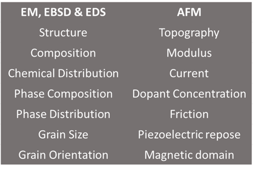
Table: The ‘visual range’ of EM, EBSD, EDS & AFM
Through attending conferences and user groups over the years I have seen a wealth of research presented with a focus on determining how and why the functional performance of a material is influenced by a combination of the material structure, composition and its properties. Since these cannot all be measured using the same instrument the use of correlative analysis has become ever more common, but the researcher is often thwarted by a lack of adequate tools for data analysis.
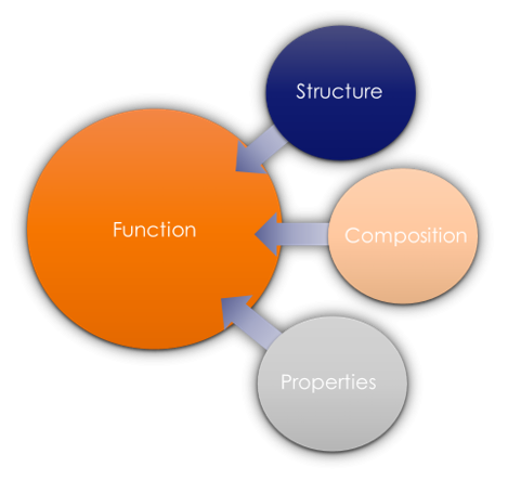
Figure: Combining different imaging modalities enhances our understanding of materials, completing the link between structure, composition, and properties
To draw an example, referring to one of the samples from my last blog, we can collect both EBSD and AFM data of a duplex steel sample resulting in the following maps.
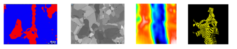
Left to Right
- EBSD Phase Map showing ferrite (red) and austenite (blue) phases
- EBSD FSD Orientation Map providing contrast between different grain orientations
- AFM Topography Map indicating the physical z-height of the sample at each pixel
- AFM Magnetic Force Microscopy Map showing the AFM tip response to magnetic domains
Presenting these images side by side it is possible to compare the different maps, to draw hypotheses and to make inferences about what relationships may exist between the different measurements. The trouble with this type of comparison is that it can be hard to know whether data is really from the same region because of changes
Frequently that is where work would stop since taking this data any further is difficult and time consuming… we remain stuck in the realm of comparisons.
A particularly diligent researcher may pursue the prize of better visualisation by exporting each map to a standalone graphic design package or other image processing software. Using such a package it is possible to manually align each image as part of a larger multi-layered stack where the individual layers can be switched on and off.
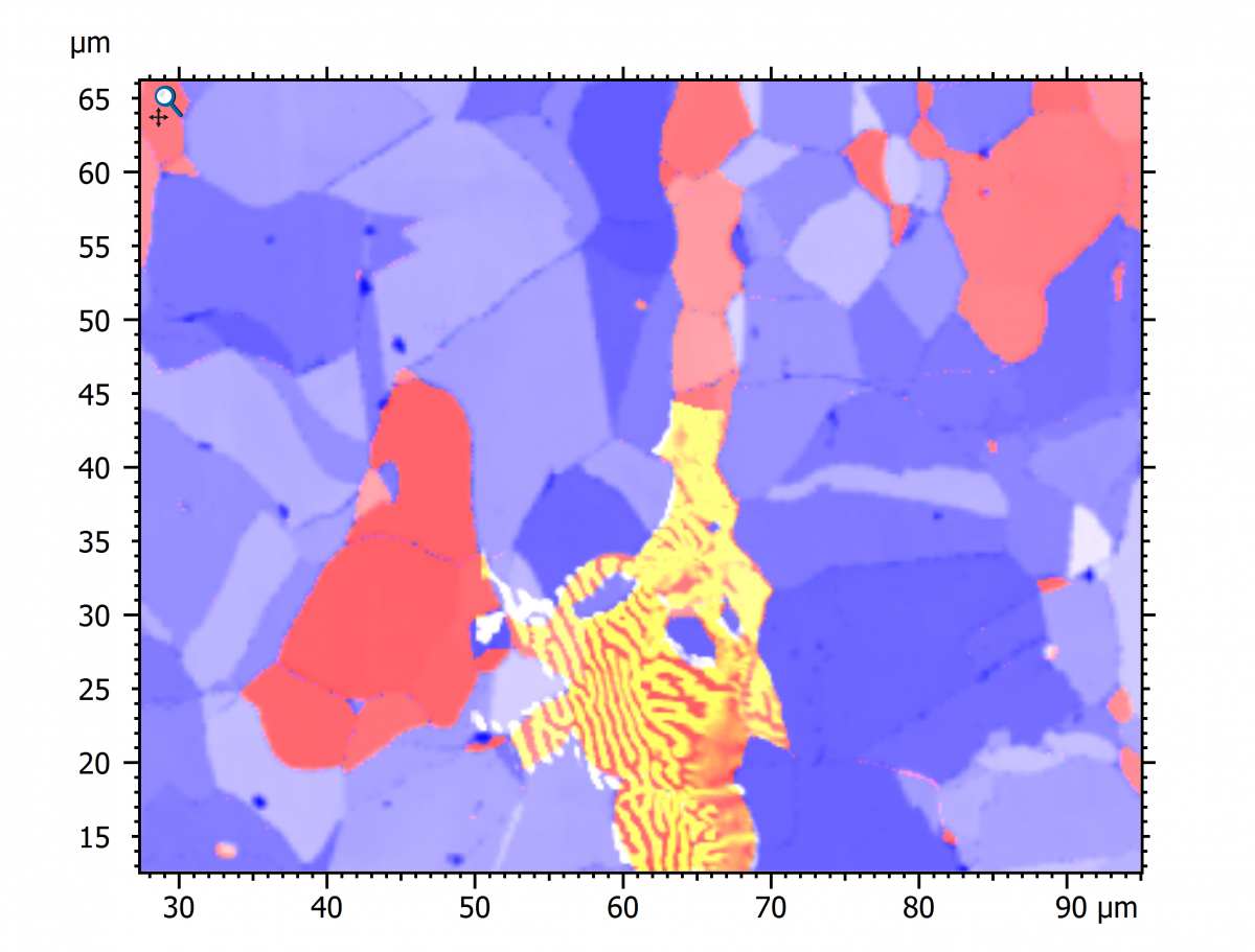
Image: Using a drawing or image processing software package it is possible to stack multiple images and manipulate them to provide correlated images Here the EBSD phase map, orientation contrast and magnetic force maps are shown.
While this process overcomes many of the limitations inherent with comparisons between adjacent images it is time consuming and suffers from another major drawback; achieving this result was only possible by transforming the source datasets into images and doing this discards the rich quantitative data generated by all that expensive lab equipment!
These experiences were the inspiration behind Relate, our new correlative software package optimised to work with EM, EDS, EBSD & AFM data. The Relate software imports and correlates images from any source but the full power is unlocked when importing data from AZtec and from AFM.
Not only can these maps be correlated and visualised in 2D and as 3D topography but since the complete datasets are imported it is possible to conduct real quantitative analyses on the correlated dataset including multi-layered profiles, threshold selection and measurements at points or over regions of interest.
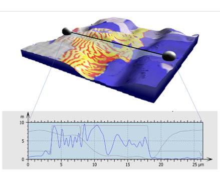
Image: Relate visualisation of AFM Surface topography coloured with EBSD phase map, EBSD orientation contrast and Magnetic Force Microscopy data.
A profile is extracted showing the real data in each map layer.
The core principle of Relate is to provide straightforward correlation, interactive visualisation, and analysis of quantitative data within documented processes and workflows to enhance our understanding of every sample.
Relate is where comparison of images stops, and correlative analysis of data can begin. To learn more, visit our website or register for this shiny new tutorial of the software.
We send out monthly newsletters keeping you up to date with our latest developments such as webinars, new application notes and product updates.

© 牛津仪器 2026
 公安机关备案号31010402003473